MACHAS
News - All the latest news straight from the artists themselves
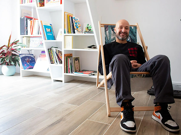
Machas Welcomes Alberto Casagrande
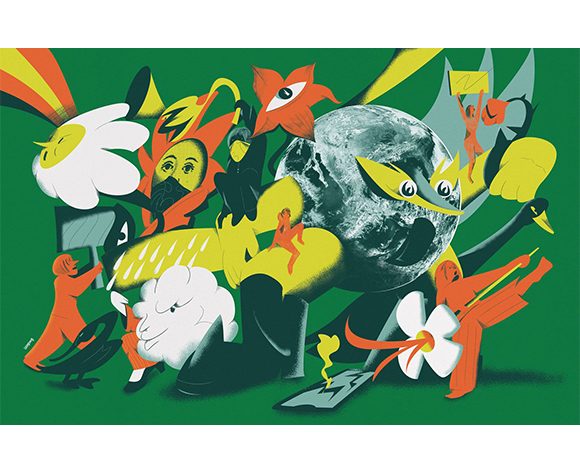
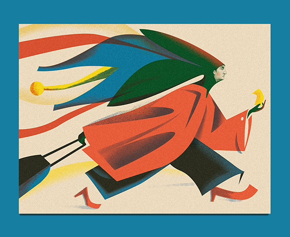
Machas is thrilled to introduce Alberto Casagrande as the newest addition to its roster. Alberto’s art immediately captivated us with its distinct approach, often blending illustration with graphic design, typography and collage, and seamlessly incorporating influences from futurism and constructivism into a contemporary vision.
Recently honoured with a gold and a silver medal from the Society of Illustrators, Alberto is undoubtedly one of the most interesting up-and-coming artists — and his story is as unique as his style. Unlike many artists who started their creative journey in childhood, Casagrande has followed a unique path: he began with a degree in languages and literature, transitioned into graphic design, and eventually found his passion in illustration. We had the opportunity to catch up with him, delving into his background, love for art, and what lies ahead.
Hello Alberto, you began your venture into graphic design and illustration at 26. What motivated you to pursue this artistic path and to believe in your abilities?
I was looking for a job! I graduated in literature in 2013, and the job market was really tough. I had plenty of free time between uninspiring job interviews, so I started thinking about a career change, and graphic design felt like a calling to me. I liked everything about it: its pragmatic approach, problem-solving, and ability to provoke or soothe, shout or speak softly depending on the message. So, I dove into it, studying and experimenting.
You first developed a passion for typography and lettering. What drew you to these aspects of design?
For me, letters are the fundamental building blocks of a project. I believed that by understanding how they function, I could better understand how graphic design works. It might have been the impostor syndrome that comes with being self-taught, but I immediately felt the need to comprehend their function.
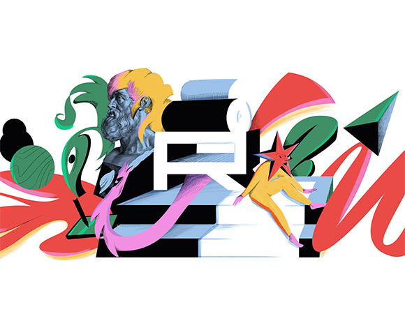
Your illustrations often incorporate lettering. How would you describe the interplay between these two elements in your compositions?
Integrating lettering came naturally with my background, but finding an approach that worked with my illustrative style wasn’t easy. Futurism, visual poetry, and constructivist posters inspired me, and I started experimenting with different lettering styles. Now, I mix hand-drawn letters, existing fonts, and even scanned wooden types—there’s no rule, just as long as everything works together!
In my opinion, an illustrator who can integrate lettering with their style has an additional tool to add more depth and credibility to their artworks. If the project allows it, I enjoy bringing the graphic design aspect to life, such as with packaging.
“TRAM” was a turning point in defining your style, transitioning from a primarily graphic approach to a more illustrative one. How did you navigate this shift?
I didn’t think I could draw, but I was drawn to illustration. When I was the in-house graphic designer at the European Institute of Design, a colleague who became my partner proposed to work together on a book called “TRAM!”. The “Carrelli tram” in Milan has a unique and iconic look. Since it was put into service in 1928, it has a decidedly 1930s mood, which matched well with a style of graphic illustration and vaguely futuristic style I was working on. So, I started working on my style right from there!
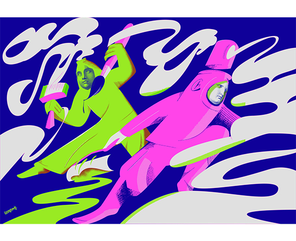
Your style clearly references futurism and constructivism but elaborates on a strictly individual and contemporary vision. How would you describe it, and from what need did this style arise?
I’ve always been fascinated by historical avant-garde movements. Visiting Casa Depero during my literature studies was a memorable experience. Depero’s talent for creating whimsical universes where everything resembles a mechanical object, along with distortions of perspective and expressive use of minimal colours, intrigues me. Constructivist posters also captivate me with their dynamic movement, spatial distortion, graphic potency, and rich experimentation with collage and various media — a trait also seen in the editing of early 20th-century Soviet cinema. However, I’m not interested in mere revival. I blend these influences to create a contemporary, engaging, and distinctly personal language. An art director once told me, “I like your work because it seems to come from an extremely old era but at the same time is very contemporary!” and I think it’s the best compliment I’ve ever received!
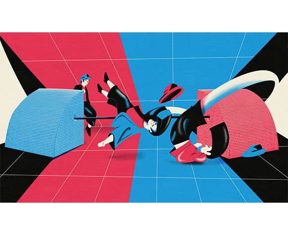
You often use a distinctive technique, skillfully mixing illustration with collage elements. How did you develop this approach?
I started blending photographic elements and “sampling” from old archive engravings into my work, juxtaposing my graphic style with these intricately detailed elements. This approach is akin to my approach of combining lettering, fonts, and movable type—using diverse sources and stylization levels, textures, and flat elements. It’s not traditional collage but an organic fusion with my drawing, blurring the lines between what’s drawn and what’s glued. Here, too, I didn’t invent anything new; surrealism, particularly the works of Max Ernst, served as a guide to develop my language.
How does your background as a graphic designer influence your creative process when approaching an illustration project?
I work a lot on solid shapes and negative space, composition as a fundamental aspect of drawing, and stylization. However, I didn’t embrace the idea that less is more; on the contrary, I tend to overload and hyper-elaborate. I don’t believe decoration is a crime; sometimes, it can help tell stories.
Which project are you most proud of to date and why?
I’m deeply attached to “Era una Nuvola,” my second book, as it seamlessly blends storytelling, graphic design, lettering, and illustration. “Un giardino in città,” my personal project, holds a special place as it marked my foray into the collage technique. “What better place than here, what better time than now?” stands out stylistically and in communication, earning a gold medal from the Society of Illustrators. Yet, I pour maximum effort into every project, so my illustrations for the New York Times best represent my current approach.
Music, literature, and cinema have influenced your artistic journey. Who and what has particularly influenced you?
I am a big music fan (I play in a band and am interested in home recording), and Peter Saville is the designer who got me into graphic design — his work for Factory Records has always fascinated me. To think about it, he also recontextualized the signs and ways of historical avant-gardes! When it comes to illustration, I really love the work of BlexBolex and Push Pin Studios (Milton Glaser, Seymour Chwast…). I’m also super keen on the Valvoline Group (Mattotti, Igort, Brolli, Carpinteri, Jori and Kramsky), who formed in Bologna back in the early 80s and mixed futurism and constructivism with the underground, punk, and psychedelia in a very cool and still unmatched way. With his free but precise forms and extremely limited palettes, Jim Flora also influenced me significantly. I’ve also recently become interested in the work of Antonio Rubino. Whenever I see one of his images, I would like to look into his head while he is drawing!
Your career began in publishing but has expanded into various areas such as packaging, branding, advertising, and ambient. How do you adapt your stylistic approach to these diverse fields, and why is it essential to express yourself across different mediums?
Various mediums possess distinct technical and communicative traits. The designers I mentioned developed a language, not just a style, that they adeptly adjusted to different project requirements while maintaining a strong identity. Today’s market often prioritizes consistency, verging on repetition, but some artists maintain diversity while remaining recognizable. As I evolve, I aim to tackle diverse projects, ensuring effective variations of my language each time and prioritizing project effectiveness above all else. It’s a much more exhausting process, but it allows you to grow and not get bored, and I hope it will bring me to the level I want to reach!
Can you share your reasons for joining Machas and how you see it contributing to the evolution of your career?
I liked Machas for its multimedia and international approach. You have remarkable clients, but above all, you have projects of different natures, some on a large scale and a great focus on design. I also like its selected and diversified roster; I hope it helps me find the right space for my art.
Lastly, what is your dream project?
Who knows! I hope my dream project comes along and surprises me, but there is always room for another dream!
See more of Alberto Casagrande’s work here.