MACHAS
News - All the latest news straight from the artists themselves
Alberto Casagrande Brings Milan’s Spirit to Life for Memorace
Machas Artist Alberto collaborated with Memorace to create a personalised finisher artwork for this year’s Milano21 half‑marathon. The Swedish platform, which collaborates with local artists across Europe, chose Casagrande to give shape to the city’s pace and atmosphere into a vivid, characterful poster.
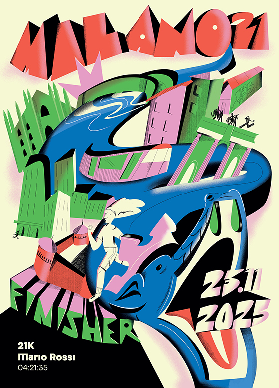
Alberto’s concept centres on one of Milan’s oldest and most recognisable symbols: the Biscione (the city’s historic serpent emblem). The serpent, that he describes as “a metaphor for flow — something ancient, dynamic, and unmistakably Milanese”, becomes the structural spine of the artwork, guiding the eye as much as the race route leads runners through the city.
The poster creates a portrait of Milan grounded in both its cultural identity and architecture, in which Milan’s landmarks — from the Duomo to the Navigli — are woven with the everyday fabric of the city: industrial façades, graffiti and traces of its working‑class districts. Casagrande’s treatment amplifies this sense of motion, drawing on Italian Futurism to create a fluid interplay of directional lines, layered textures and bold typographic elements that echo both the rhythm of the race and the city’s energy.
Designed as a keepsake for runners, the artwork celebrates not only the achievement of finishing the race but the experience of moving through Milan — its landmarks, rhythms and layered identity. As Alberto shared with Memorace, “I hope they feel a sense of accomplishment intertwined with belonging.”
That sense of place runs through every decision in the artwork, and his conversation with Memorace offered a deeper look at the ideas, references and Milanese nuances that shaped the poster. We share the full interview below.
Interview with Alberto Casagrande
(Originally published on the Memorace website)
What was the first spark or idea that led you to shape Milano21’s artwork around the Biscione?
The Biscione felt like the most natural starting point. It’s one of Milan’s oldest and most recognizable symbols, but it also carries a sense of motion, mythology, and identity. When I thought about the energy of a race weaving through the city, the serpent immediately became a metaphor for flow: something ancient, dynamic, and unmistakably Milanese. That was the spark: taking a historic emblem and letting it become the heartbeat of a contemporary event.
Milano21 has a strong “rocking” identity this year — how did that influence your artistic approach?
It came naturally from the way I draw: bold contrasts, sharper rhythms, and a visual language that doesn’t sit still. I always create artworks that feel loud, that explode in the page and rely on asymmetrical balance to create movement and energy. Of course I had to blend it with Milan’s elegance, so I paired the vintage, art deco vibe of the city with some graphic, and typographic, grit.
Your composition blends architecture, symbolism, motion, and typography. How did you decide which elements of Milan to highlight?
I chose elements that speak to both the everyday and the iconic. Milan has landmarks everyone recognizes, but it also has elements that escape the fashionable side of the city. I wanted a balance: the symbolic power of places like the Duomo, the skyscrapers and the iconic Navigli, but also a strong tribute to the suburbs, the old working class buildings, the facades covered with tags and graffiti.
The artwork has a dynamic line and rhythm running through it — almost like a visual soundwave. Was this intentional?
Absolutely. I wanted the entire piece to feel like it moves, like you could almost hear it. The line acts as both a pulse and a pathway. It echoes the cadence of running, the vibration of a city that never stops evolving.
The Biscione also acts as the race route in your concept. How did you approach weaving storytelling into the illustration?
By letting the Biscione become a narrative thread. It guides the eye through the city the same way the race guides runners through Milan. Every twist of the serpent leads to an architectural or symbolic moment. So rather than arranging elements randomly, the composition follows the idea of moving through Milan at human scale, discovering its layers with every kilometer.
Futurism and 20th-century Italian design seem present in your lettering and structure. How do these influences show up in your work?
Italian Futurism has always fascinated me. Its obsession with speed, dynamism, and modernity aligns perfectly with my attitude: I’m a frantic, volcanic person who rarely stands still and is always eager to create. And I think this approach fits beautifully with the concept of a race!
Also, with a background rooted in graphic design, I can’t help but love Futurism’s visual approach — its limited palettes, its mechanical reinterpretation of natural forms, its bold and experimental lettering.
I try to incorporate these ideas into my own visual language, hybridizing them to make them feel fresh and contemporary, adjusting the “vintage knob” depending on the needs of each project.
How important is it for you that an artwork connected to a race also reflects the cultural identity of the city?
For me it’s essential. A race is not just a sporting event; it’s a collective experience that happens in a very specific cultural landscape. When athletes travel to Milan, they don’t come just for kilometers: they come for atmosphere, history, beauty, and a sense of place. The artwork should honor that. It should feel like Milan even before you read the name.
When runners look at their personalized piece after the race, what do you hope they feel or notice first?
I hope they feel a sense of accomplishment intertwined with belonging. I want them to recognize elements of the city they ran through: moments they may have passed in a blur but can now revisit visually. Ideally, the first thing they notice is the movement: the way the lines, shapes, and colors echo the physical experience of running through Milan.
You work across illustration, visual design, and Milanese cultural expression. What does creating the official Milano21 artwork mean to you personally?
It means contributing to the visual identity of an event that celebrates both people and place. Milano21 is more than a race; it’s a snapshot of Milan’s energy in a given year. Being entrusted with its artwork is like being asked to translate the personality of the city into a single image. For me, it’s both an honor and a creative challenge: one that connects my love for Milan with my passion for visual storytelling.
See more of Alberto’s work here.