MACHAS
News - All the latest news straight from the artists themselves
ReThink collage: BECHA x ENI
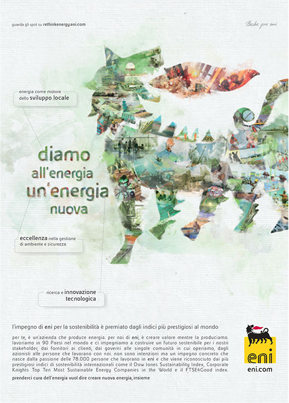
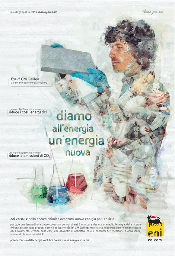
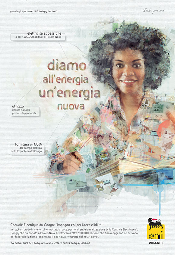
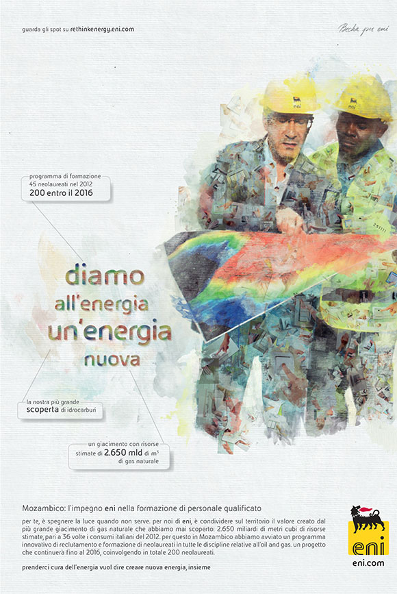
With more than 20 artworks produced over a period of more than two years, BECHA’s ENI ReThink campaign is without doubt one of the most successful and long-standing campaigns of the European energy supplier.
Focusing on promoting a sustainable and more conscious approach to energy consumption both at the supplier and user end, the campaign comprises of different artworks in which the subjects emerge from BECHA’s elaborate use of collage and intuitive paint strokes.
For all of you familiar with BECHA’s style, the Eni campaign stands out for the very different approach to her collage technique: “the client required this campaign to be instantly recognisable but at the same time to adopt a visual solution that could be applied not just to one or four ads but 10 or more ads with different motives”, BECHA recalls. “We ended up producing more than 20 ads whilst presenting each time a different message in a visually interesting way.”
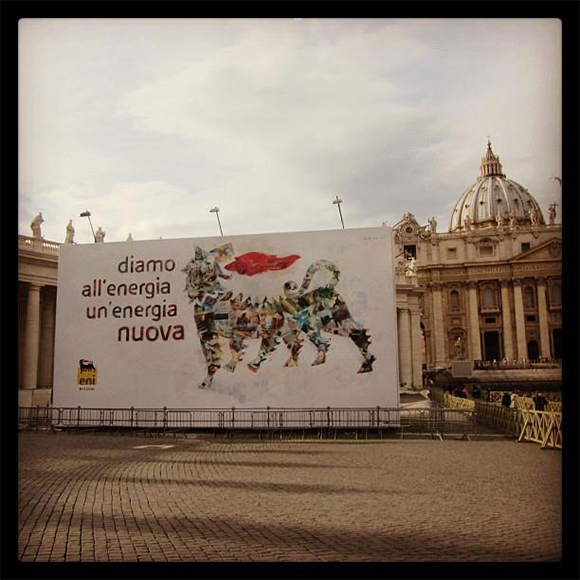
Upon closer inspection each subject reveals an intricate collage pattern of carefully arranged photos, depicting gestures relevant to the campaign’s message such as switching off the light or turning down the thermostat.
“The main element I used were the photos of the gestures”, says BECHA. “Each photo was printed, some of which were treated with water-colour strokes and some weren’t, and then photographed again. After that I created the main image with photographed material using Photoshop and lots of digital brushes.”
“It wasn’t the first time I did ‘real’ collage” recalls BECHA, “as at school I started learning the traditional technique first. I am glad that after such a long time a commercial project was the starting point for taking paper and graphic tools in my hands again. Of course, since the deadline for every ad was tight I had to finish some part of the collage digitally but I tried my best to keep that analog feeling.”
Such an interesting and unusual approach required preparation: “at the beginning we made a lot of sketches and back and forward with TBWA’s creative director to find a strong art direction. But that was a good basis for whole project and then it was fun to work on new subjects with an established process.”
The campaign was seen everywhere in Europe: from billboards to newspapers, from POS to digital. It was even in St. Peter’s Square in Rome as a 5 by 6 meters hoarding!
“I think that was the first image I made and it was the first time that I saw it on air. I mean, I was satisfied with results but watching it on the screen and in real life it’s a completely different thing. So, at first I thought “Oh, this came out really nice…” , and then “...oh my, is that St. Peter’s Square?!?!?!”
See more of BECHA’s work here.