MACHAS
News - All the latest news straight from the artists themselves
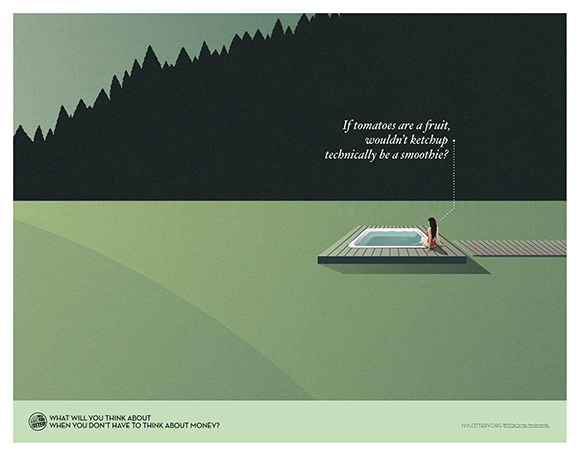

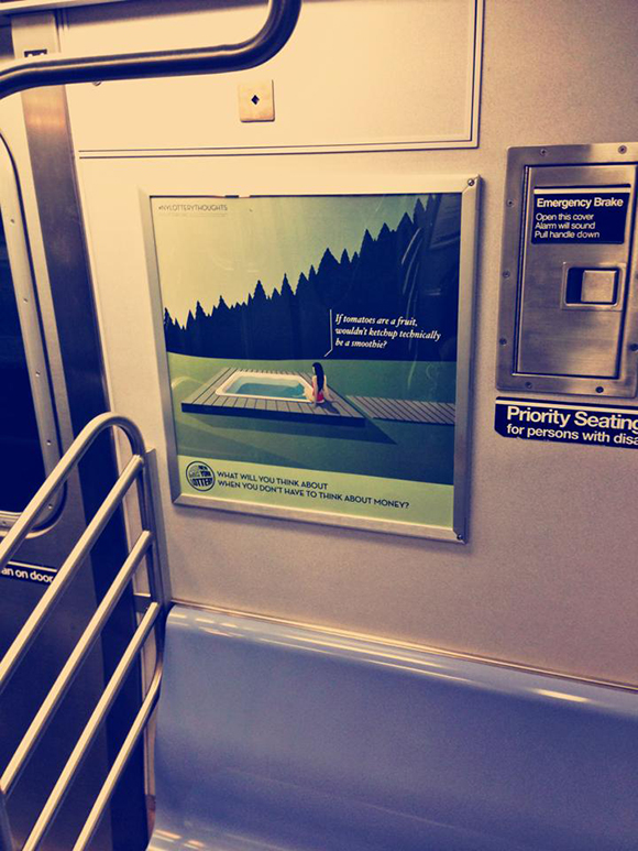
The winning image that Ray created for the pitch
Lucky ticket: Ray Oranges x New York Lottery campaign
In an age when even uber-wealthy types like Kanye West and Kim Kardashian are stressing about piling up as much royalties as possible just to be sure to provide for their spawn (really!), it is quite clear that money dominates the majority of people’s brain.
But unlike Kimye, most of us normal people are not really scheming to achieve world domination. Actually, being the owner of a winning lottery ticket would be quite an achievement. Even a frugal thousand dollar ticket would do — no need to be greedy! A healthy account balance would make most people happy, plus Mr. Brain wouldn’t get bogged down anymore by annoying money related worries. So what to do with all this free time? This is exactly what DDB New York went out to discover for their brand new New York Lottery campaign illustrated by Ray Oranges.
DDB NY had a clear vision of how to visually execute the campaign and, although they showed a strong interest in Ray’s work from the very start, he was asked first to participate in a pitch phase against two other artists. “It was a bit tense as this was the chance of doing my first ever campaign”, remembers Ray, “and I surely didn’t want to miss out on this great occasion!”
“For the pitch phase I was presented with six possible scenarios to chose from, and right after the initial conference call I had one word scribbled written all over my notepad: “simplicity”! So I opted for a scenario that would use just one colour and the sea as seen from above was the perfect solution.”
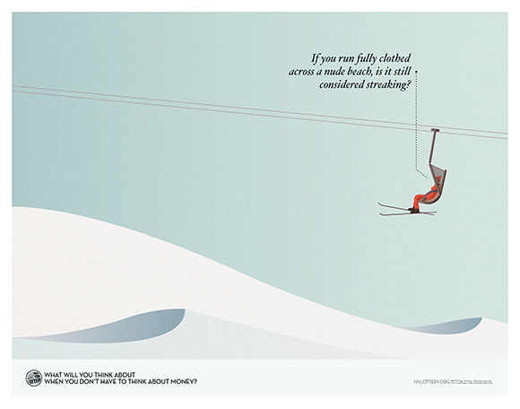
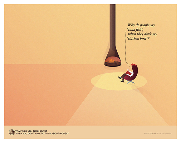
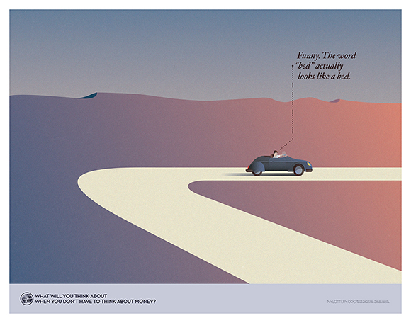
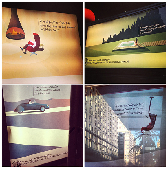
The artwork presented, an elegant woman on a boat sunbathing in the warm summer light , granted Ray the job and, under the creative guidance of the DDB team, he went on to create four ads that balance beauty with witty copy, spacious landscapes and the human figure. “Finding a good balance in the composition between the vast settings and the human element was relatively easy - the fact that I could create such landscapes allowed me to nestle the subject in a very organic way” explains Ray. “I have also tried to avoid referencing any specific location and to use one dominant colour so that it could be easier to create an empathic feeling with the viewer.”
This was Ray’s first foray into the advertising world, noticing a remarkable difference from the editorial world: “the purpose of editorial illustration is completely different from the advertising one: the first has to make an impact on the mind, whereas the latter aims straight to the heart. However this campaign was quite interesting because it blended the best of the two worlds: an illustration to win over the heart of the viewer and a strong copy to intrigue the mind - a very good mix!”
We got in touch with the man behind the ad Carlos Wigle, Art Director at DDB NY, and asked him his point of view on Ray’s work on the campaign: “We at DDB were looking for something unique that would cut through the clutter of the ordinary advertising convention. Our new lottery campaign required visuals that would catch the consumers eye in an artistic way creating a different type of band connection. When I saw Ray’s work, I knew he was the perfect fit. Ray has a great way of using negative space to his advantage. His use of color and texture can make even a simple scene feel extremely dynamic. The reaction to our campaign prove that his illustrations helped our insight come to life in the best possible way. Thanks Ray!”
The campaign has also been featured on the pages of the New York Times