MACHAS
News - All the latest news straight from the artists themselves
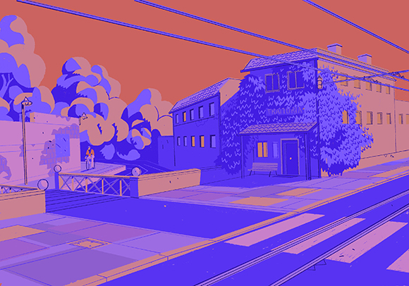
Donna Moderna illustration of Milan
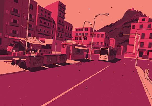
Donna Moderna illustration of Palermo
Donna Moderna illustration of Rome
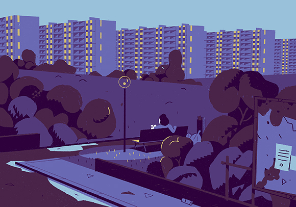
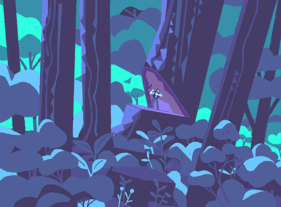
Donna Moderna image of Naples
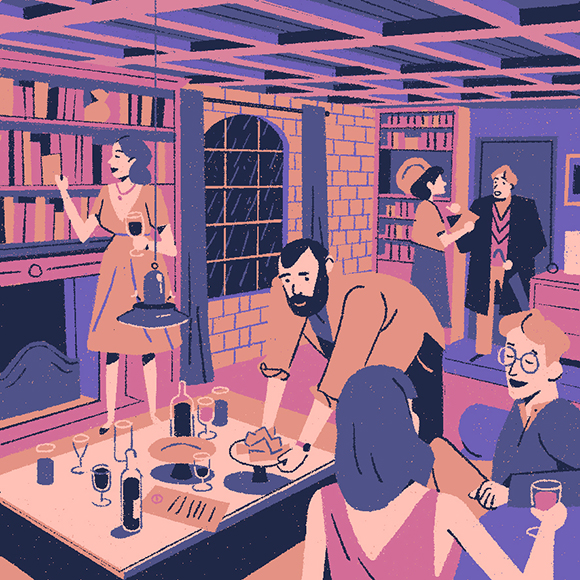
Wired UK Dinner Party
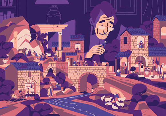
Donna Moderna Nativity scene
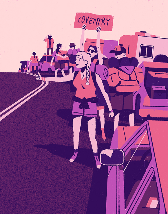
The Pitch Fork Review
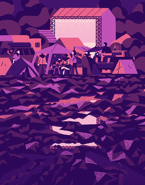
The Pitch Fork Review
Oprah Magazine
Usbek & Rica
Constant Flow: Matteo Berton’s on form with stream of editorial illustrations
Storytellers are by nature, inventive. Always motivated by new ideas, they let their curiosity lead their creation of fascinating landscapes and unusual subject matters. Perhaps this is why Matteo Berton constantly surprises us with his innovative exploration of space and colour. It’s also the likely reason why Matteo has a constant flow of editorial commissions. Over the last few months his illustrations have seen him determining dinner party etiquette for Wired UK, escaping to festival fields for The Pitch Fork Review (US), seeking out urban secrets for Donna Moderna (ITA), grappling with the future of immense American forests for Oprah (US) and relating humans with nature for Usbek & Rica (FRA).
So how does Matteo manage to conjure the details of such varied narratives? The clue is in the composition. Just as the differing articles present unique views of their topics, Matteo’s sensitive eye anchors them in unusual perspectival angles. ‘I like noticing details’ admits Matteo. ‘shifting from macro to micro is one narrative solution that I really love’. This approach is plain to see.
Matteo’s four illustrations for Donna Moderna capture the spirit of Palermo, Naples, Milan and Rome by considering how light controls the atmosphere of semi-urban expanse. His images’ off-centre rear view enables the viewer the sense of being a first-hand witnesses. Matteo’s ability to draw the viewer in takes flight from his own involvement with the scenes. ‘Most of the time I get inspired by overwhelming landscapes and architectures. I love feeling small in big spaces’. Like memories or snapshots in time, Matteo captures architecture’s sense of temporal infinity by stripping back the images to just two colours. Detail is then developed through a clever layering of lighter and darker hues against the bold stretches of monochromatic colour. Similarly in another illustration for Donna Moderna, a man setting up a Nativity Scene is positioned face on to the viewer so that they become enveloped into the narrative.
Matteo is equally in his element creating figurative scenes. Where his landscape works carry a calming purity, Matteo adapts his approach to depict the kinetic vigour of people in action. For Wired UK a more varied palette consisting of hues at peak saturation play off one another illuminating the lively conversations and ripe animation of dinner party guests. As the host lays out cheese and guests linger over wine or peruse the ample bookshelf, Matteo’s warm representation lends the narrative a relatable familiarity. So where does Matteo look when creating his resonant illustrations? ’References come from everywhere’ admits Matteo. ‘I guess I first have a blurry idea of the image’s elements and then I go looking for them’.
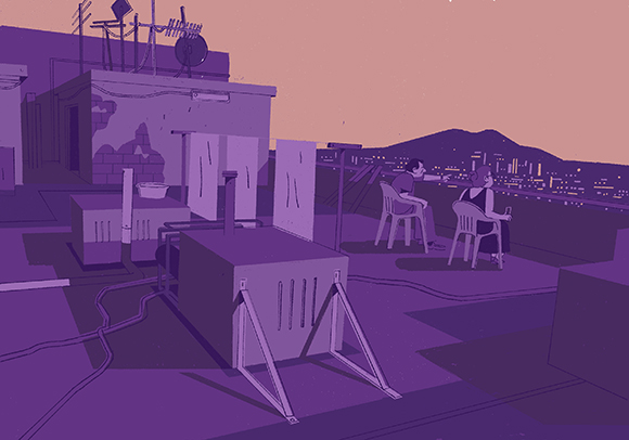
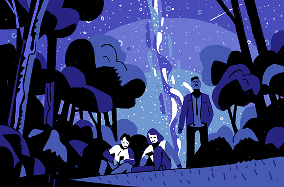
In The Pitch Fork Review Matteo’s illustrations concentrate on the alternative escapism offered by the Phish festival. The image combines his natural instinct for nature with his observant portrayal of people and movement. ‘I’m definitely suited to work on this subject. I enjoy highlighting the contrast between insignificant human matters and the magnificence of nature’. Choppy, juxtaposed shapes add depth to the Phish fields as people blend seamlessly into the landscape. Similarly Matteo’s images for Oprah magazine depict the co-existence of man and nature. Using a reduced, contemporary aesthetic Matteo captures the haunting, desolate effect when man tries to fight organic matter.
For France Usbek & Rica’s Future of Mankind article, Matteo’s acute vision rekindles the harmonious relationship between modern humans and nature. ‘I decided to start playing with the angle of view’ Matteo admits. Rather than a frontal or side view, land, sky and humans meet in compositional balance. With Matteo’s understanding of weight, shape and colour, it seems he has many stories to tell.
See more of Matteo’s work here