MACHAS
News - All the latest news straight from the artists themselves
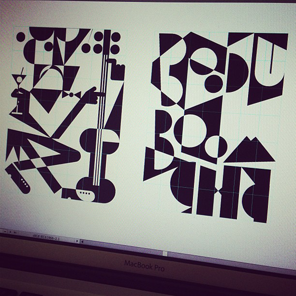
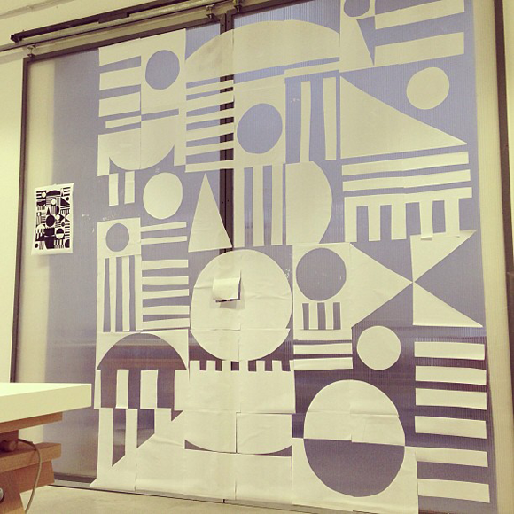
Working out the grid system
Before
After
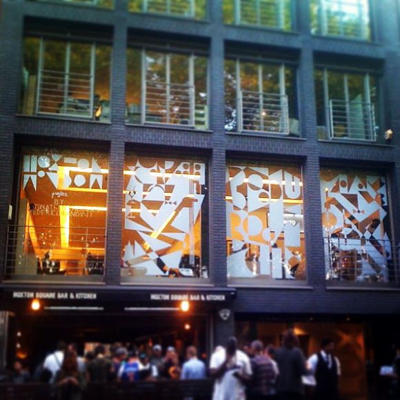
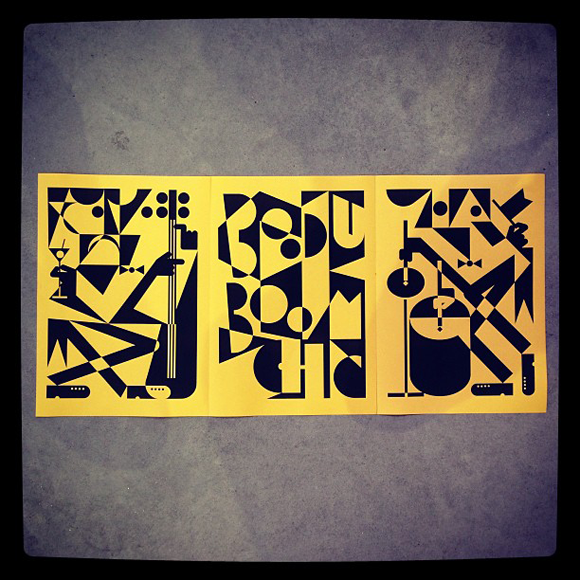
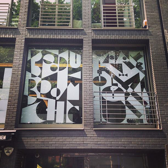
BOODO BOOM CHAM: Calugi & Landini x Unit9’s Window Project
Jonathan Calugi and Federico Landini share more than a studio space and a mutual love for hip-hop and it’s not rare to see them collaborating on developing quite diverse creative projects. From the amazingly inventive “Shape Your Head” workshop to the colorful PUF Festival brand identity, when the duo join forces the result is unpredictably interesting. When Unit9 called them to spice up their Window Project we knew we wouldn’t be disappointed.
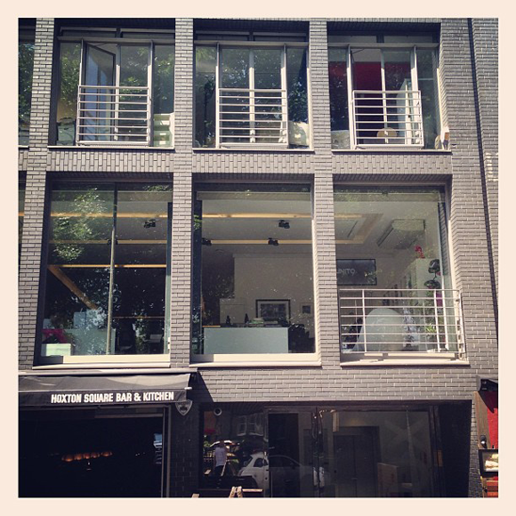
The four windows are overlooking Hoxton Square, in the very heart of London’s creative hub Shoreditch, and are displaying a monochrome see-through blend of illustration and typography, where Futurism is mixed in equal parts with Jazz and the artists’ visual signatures. We caught up with Jonathan and Federico for a refreshing Bloody Mary and to know more about the project.
BOODO BOOM CHA is the name of your artwork for Unit9: what was the inspiration for this project and how do two different creative processes work together?
JC: The starting point of the whole concept was Futurism as I’ve recently rediscovered the works of the likes of Depero and Marinetti. Dynamism is a key element of that aesthetic movement however we opted for creating a static artwork that leaves the dynamic element to the life that happens beyond the artwork.
FL: We first evaluated the technical side of the project and then we developed what, in our opinion, was an interesting visual solution. The surface to work with is huge and we aimed at creating something that would make an impact. However we laid down one basic rule: to use only simple materials. True, this was a limitation but we didn’t see it as a constrain, quite the contrary: we used this limitation to push ourselves even further and we created an illustration and type that could be reproducible through a grid structure.
From the technical point of view how did you approach this project?
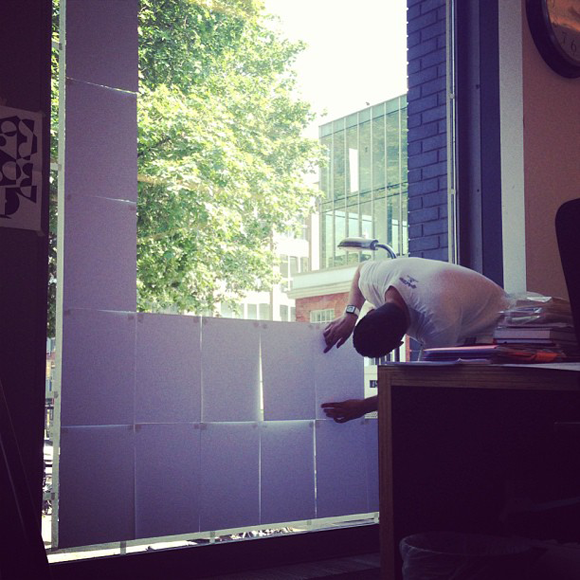
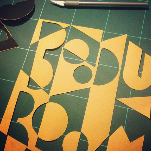
JC: With paper, spray glue, disposable knife and a ruler. At the beginning it seemed complicated but Federico found a very clever way to deliver the project.
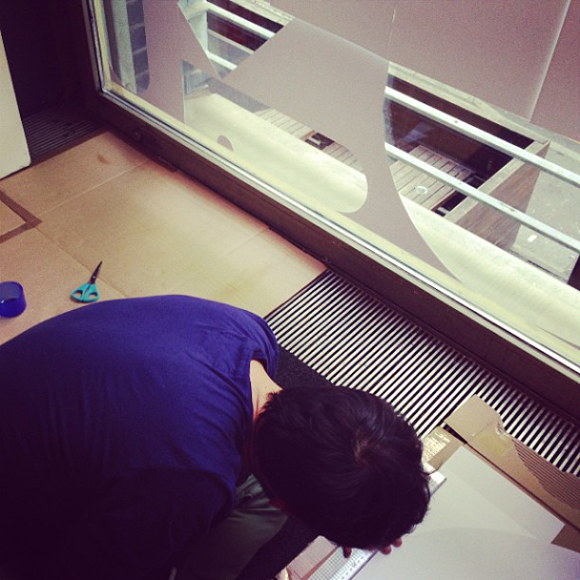
FL: We basically approached each window as a giant paper puzzle. We digitally draw the artworks on a 1:10 scale and then divided each image in a 7x7 grid of A3 sheets. We laid this paper puzzle on the window putting the sheets one next to the other and then we started to remove them one by one, replacing each sheet with another A3 where we previously cut out the see-through bits.
Where does the name “BOODO BOOM CHA” come from?
FL: We wanted to reference the sound of the instruments we represented in the artwork: “BOODO BOOM” is the sound of the bass and “BOOM CHA” the sound of the drums - an obvious wink to Futurism.
How do you guys always work on such different projects?
FL: we share the same studio space and it is easy to discuss and bounce off ideas, so when we are given the chance to work together we jump on it!