MACHAS
News - All the latest news straight from the artists themselves
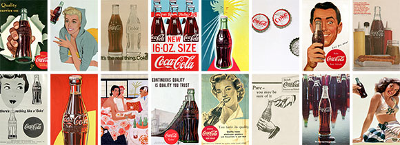
Straight from the Coca Cola's archive: the posters that were used as inspiration.
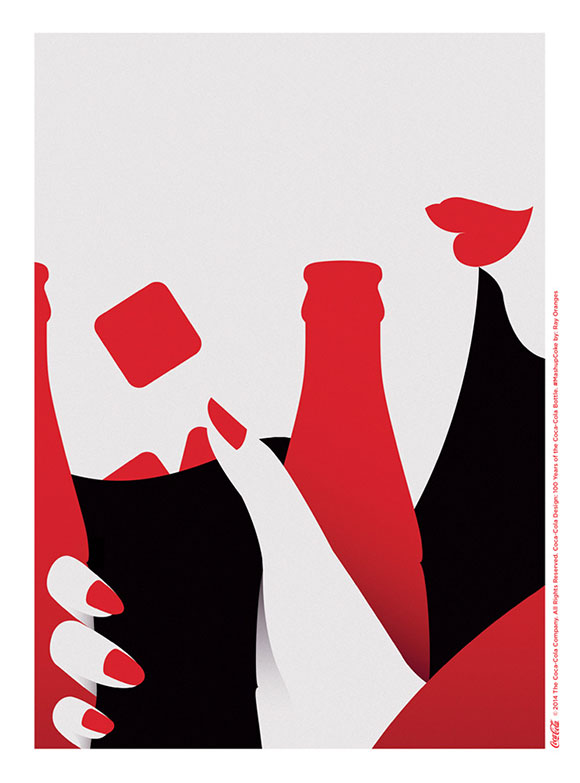
100 for 100: Ray Oranges for Coca Cola
A quick glimpse at Coca Cola’s history will clearly reveal how art has been an instrumental factor in transforming a well-designed and appealing product such as the Contour bottle into an icon that proceeded to go beyond its product category to embrace all American and Western culture.
To celebrate the 100 years of the Contour bottle, Coca Cola has commissioned 100 creative minds from all around the world to re-interpret few key images of their archive where the Contour bottle is the main protagonist — and our Ray was one of the artists that Coca Cola reached out to.
Ray’s poster is particularly striking as it uses Coca Cola’s key colours but has added a vaguely sensuous twist to the familiar woman-drinking- Coke archetype. “Many will find my choice unexpected as Coca Cola is mostly perceived as a family-oriented brand” admits Ray, “however if you take a look at their archive you will see subtle elements that drift away from an unidimensional communication towards a more adult yet ‘stubborn optimistic’ approach. That’s where my inspiration came from. My body of work is featuring in great part very abstract subjects but now the human form is becoming more present; with this poster I wanted to explore an aspect, a nuance that my artworks haven’t revealed yet — until now ”.
See all the 100 poster here and more of Ray’s work here.